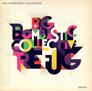
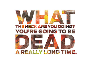
Here is my work assignments for rag-left-right designs. I found this design style to be challenging because shifting the letters horizontally can create design problems. But where are problems, there are solutions! I am still having a difficult time with kerning, but hopefully I will get better.
Monday, September 24, 2012
Rag-right-left inspirational designs
Here are some inspirational examples of rag-right-left designs. These are designs where the typography tends to be centered or be flush and/or left.
 |
| Fabian De Lange |
 |
| Mads Berg |
 |
| Hello Von |
 |
| Stefan Sagmeister |
 |
| Neil Robert Leonard |
 |
| Priest & Grace |
 |
| Craig Ward |
 |
| Neil Robert Leonard |
 |
| Ena Baćanović |
 |
| Mucca Design |
 |
| Neil Robert Leonard |
 |
| Doyle Partners |
 |
| Mucca Design |
 |
| Priest & Grace |
 |
| Priest & Grace |
 |
| Priest & Grace |
 |
| Priest & Grace |
 |
| Neil Robert Leonard |
 |
| Unknown |
 |
| Mucca Design |
 |
| wk12 |
 |
| Hylton Warburton |
 |
| Mucca Design |
Tuesday, September 18, 2012
Inspirational 'square up' designs
So one day I decided I should get better at typography. Thankfully Genevieve Williams is teaching an excellent hands on 8 week class on core typography skills. For homework we were to scour the web for a type of design Genevieve calls “Square ups”. This is when a typographic design makes up a square or rectangular space. Flourishes and other decorational elements are allowed and letters can be at an angle as well.
Subscribe to:
Comments (Atom)


